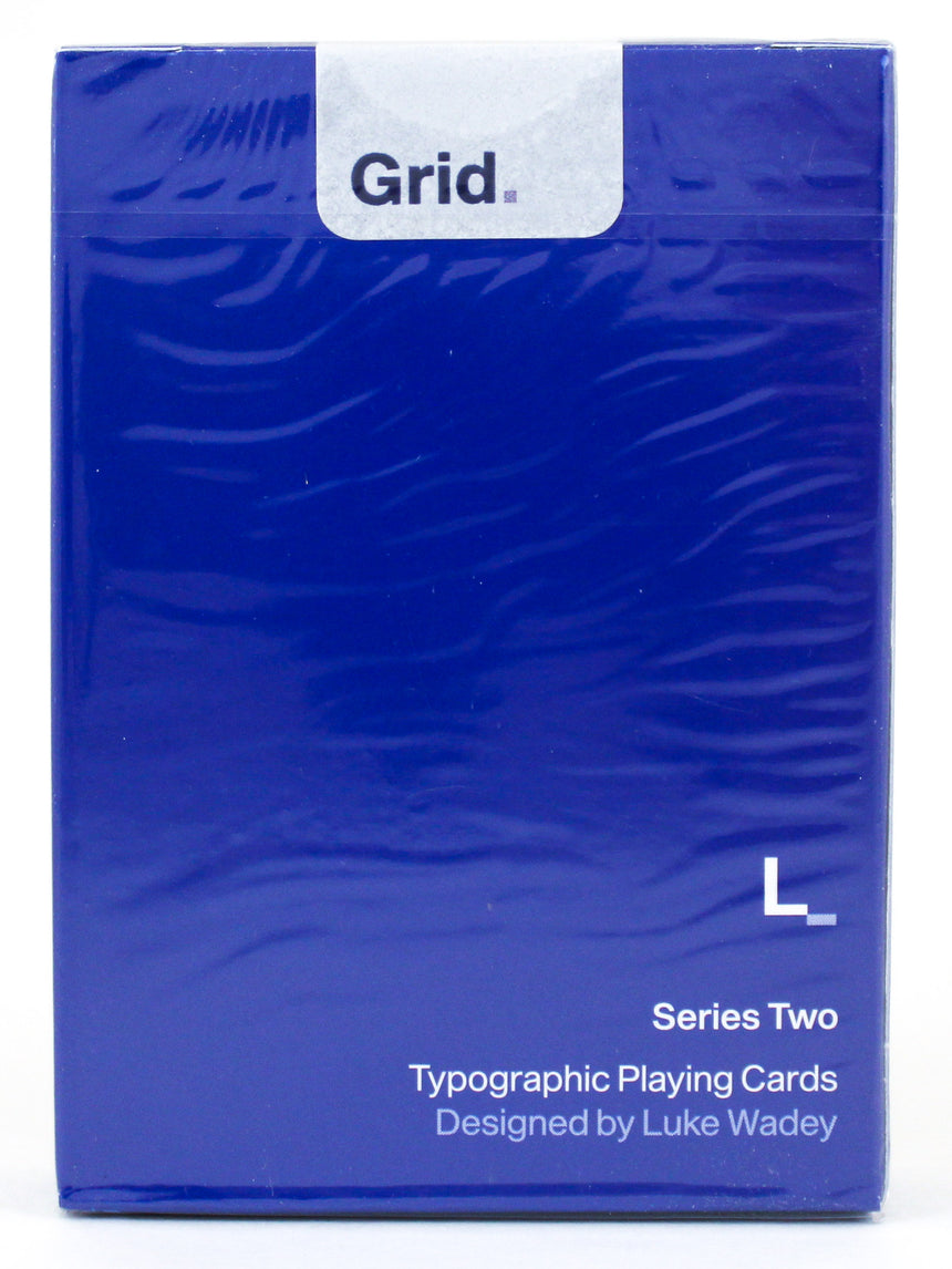
Grid Series 2
by Luke Wadey
$12.00Designed by Luke Wadey, the Grid Playing Cards is a three-part collection based on the design principles of the International Typographic Style, otherwise known as the 'Swiss Style' of graphic design. Its main principles are readability and cleanliness, with most creations adopting an asymmetric layout, always based on the use of a grid. These grids, usually made up of hidden columns and rows, are used to align words, numbers, pictures, and patterns, so each series in the Grid Collection adopts these principles.
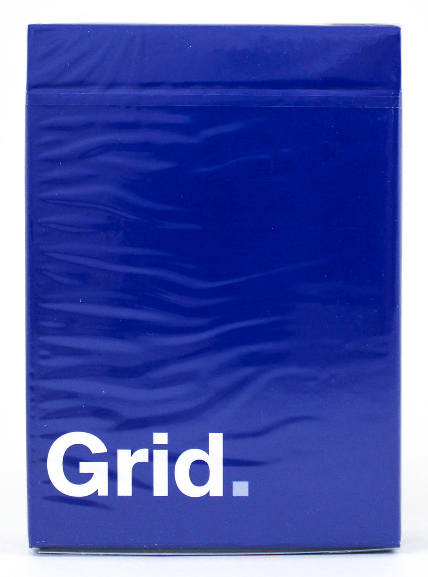
Grid Series Two really is part of a unique collection of designs. A 'must have' for collectors and performers alike, cardistry users are finding ways to use the Grid Series to bring a new dimension to their performances. With a onetime print run limited to 2000 units, printed by USPCC, these 56 poker-size playing cards are printed on linen stock with air cushion finish.
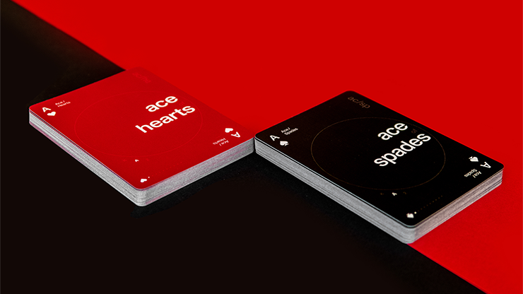
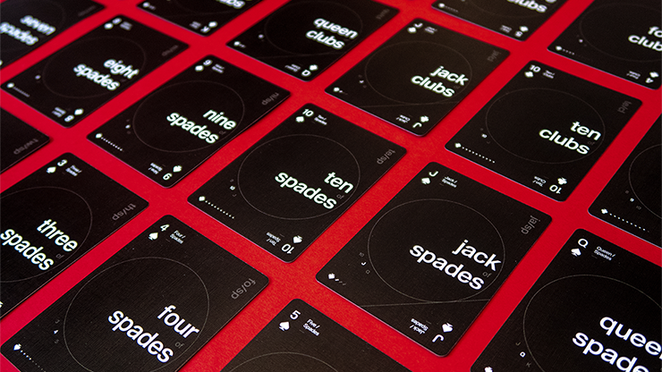
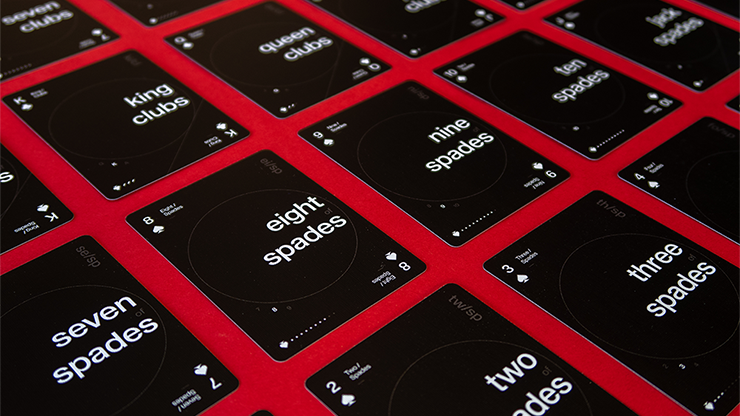
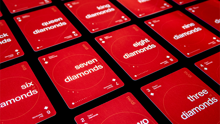
With Grid Series Two, as well as vertical and horizontal alignment like in Grid Series One, Luke has introduced the circle to create a dial effect and explore how different grids can be used on playing cards. Each card has a set of alignment with the numbers and letters that sit on the edge of the circle so that they appear to have the same alignment, whilst not always sitting in exactly the same place on each card.
As a graphic designer more than an illustrator, as well as a card collector, Luke wanted to find a way to combine two of his biggest passions and make a collection of decks that truly stand out from the crowd. Dynamic typography and bold color really bring this deck to life.
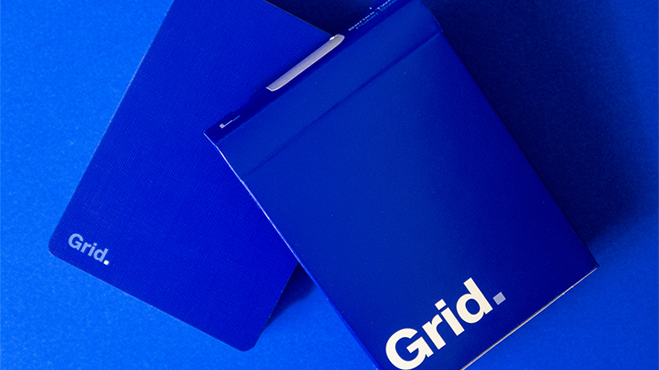
Doing away with traditional pips and instead adopting a typographic format, each card acts like a miniature poster, with bold words setting the theme, rather than illustration and numbers. The design is minimal but functional -- even the back of the card is super stripped back to just the name of the deck, with full color bleed for real impact of color. The 'picture' cards each have a diagonal line introduced as a minimal graphic, yet it symbolizes the diagonal nature often found on traditional picture cards where the suit is duplicated and rotated.
The cards can be read and viewed in many different ways, with only two being symmetrical. Let's take the seven of diamonds for example.
1) The card is written in its full name: seven of diamonds.
2) The 7 and the diamond pip are placed in the traditional corners.
3) Written with upper and lowercase next to it: Seven/Diamonds.
4) Around the circle, there is the current sequence of cards including before and after the current card; 6 7 8.
5) Short hand code in the upper right corner: se/di.
6) In the lower left corner similar to Grid Series One, the current card is shown by the pip and lit-up dots, with ones that don't apply being faded out for ace to ten, and then switching to diagonal lines for the picture cards; so, the diamond pip with 7 white dots would be lit up.
Don't miss the chance to get yours now and try a new way to play.
Design: Luke Wadey
Print: United States Playing Card Company
Photography: King of Cards
NOTE: All decks ship in a deck sleeve and in a cardboard box to insure a safe arrival to its destination.